
"Sometimes a simple creative photography trick paired with a band's creative vision can bring about an instantly recognisable classic of its genre and a cultural piece of art."
In 2026, the art of the album cover is duly recognised, as the Recording Academy adds Best Album Cover to the categories for the GRAMMYS 2026, nominating Wet Leg, Bad Bunny, Djo, Tyler, The Creator and Perfume Genius.
Acknowledging the power of the album cover as an art form itself has grown in tandem with the evolution of the album format and physical media, the surging popularity of vinyl allowing for 12" size sleeve – a much bigger picture than any artwork for tapes or CDs. From the etched timber school desk of Lauryn Hill's Miseducation, the famed night out-photoshoot with Adam Sandler look-alike Chris McClure for Arctic Monkeys' debut or the pop culture-infiltrating green of Charli xcx's Brat, cover art continues to be integral to how we experience an album, and its world-building capabilities.
In celebration of the art of an album cover continuing to thrive, Rough Trade East's Kerenza takes a dive into our Rough Trade Essential range to reflect on a selection of iconic covers and their origin stories.
"If there’s anything that my time at Rough Trade has taught me is that at a certain point, there’s only so many times you can listen to your favourite albums before you absolutely cannot listen to them anymore (excluding a few of course).
So what do you do when you don’t know what to play? Maybe it’s a quiet release week, or you’re just completely drawing a blank. For me? You dig through the racks until the cover speaks to you. I’ve found some incredible albums that way. I know they say ‘you should never judge a book by its cover,’ but they never said anything about records…
I have quite a specific standard for what makes an album cover so great. I’m a sucker for a good story behind a photograph, but I also love anything poetic, abstract, or so uniquely portrayed; it's like nothing I’ve ever seen before. The list below is subjective; with that in mind, for me, it's what stays imprinted in my head after seeing them in the racks. Your top ten list will most likely look completely different to what I have chosen, and that’s the beauty of it. With this in mind, I thought we’d take a look into some of the most iconic album covers we stock within our racks at our Rough Trade stores. (In my very humble but always correct opinion)"
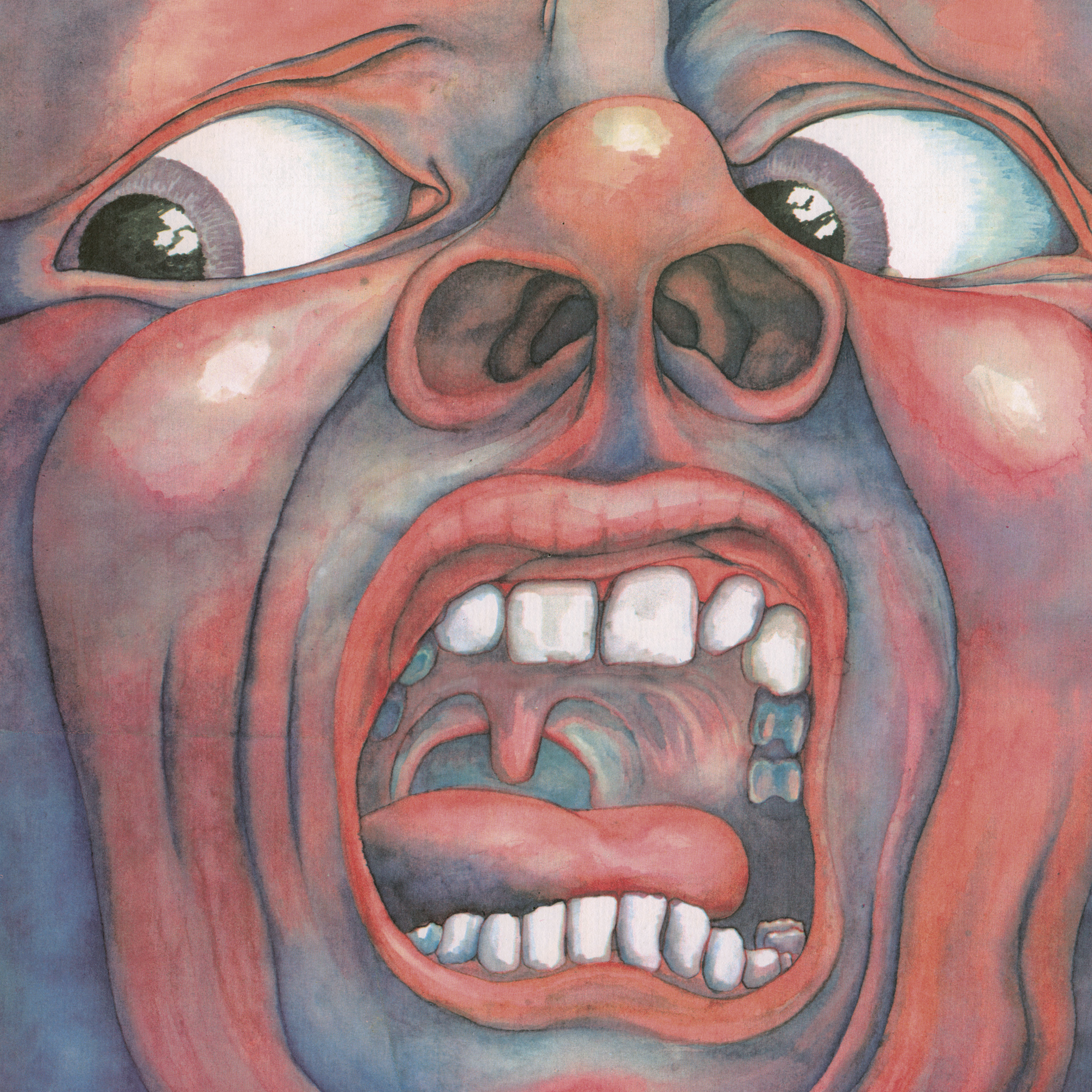
King Crimson - In the Court of the Crimson King (1969)
The fabled ‘Schizoid Man’ is a face that’s very hard to forget. Painted by computer programmer and art school friend of the band, Barry Godber, by using his own face in the mirror. It’s a hauntingly chaotic image, especially paired with the untimely death of Godber at 24, shortly after the album's release.
Interestingly, the album cover displays no text, which was a radical move at the time of release for an album cover. I think this owes to the album’s success and widely known cult status amongst collectors, alongside the incredible album itself. It persuades you to buy the album on sight, without knowing anything about the music.
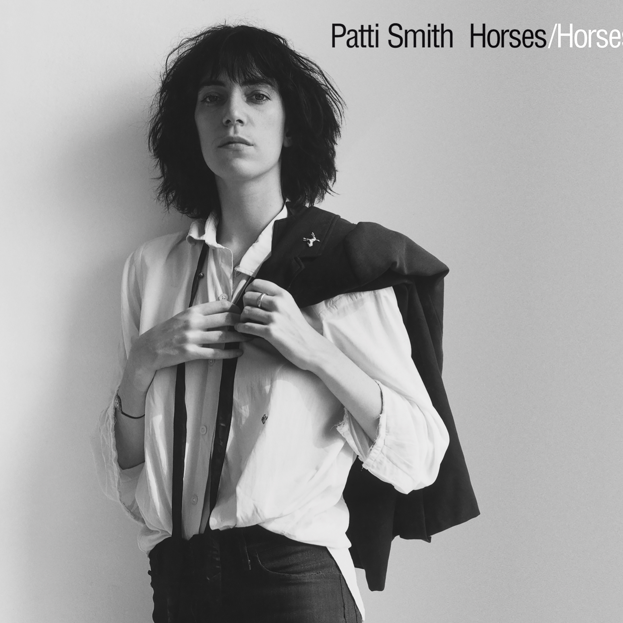
Patti Smith - Horses (1975)
Anyone who’s read Just Kids will know the story of this cover, and also will never shut up about reading Just Kids (Don’t worry, myself included.) Dear friend, collaborator and subject of the book, Robert Mapplethorpe, is owed for this strikingly recognisable cover. A moody, androgynous, Baudelaire-inspired Smith glares at us from behind a film of black and white. Donning a simple white shirt with a jacket tossed over her shoulder, she just oozes defiance and art, like a true poet. Selected from a range of eight similar photographs taken in a Greenwich Village Penthouse owned by Mapplethorpe’s lover, (Who actually suggested the jacket toss as an ode to Frank Sinatra's style). This photograph is a snapshot of a bygone era, iconic in its simplicity.
Mort Garson - Plantasia (1976)
Ok, this one I do own on a t-shirt, vinyl, and I’m daydreaming of owning a cassette copy one day. The story of this album is so interesting, but I’ll keep it brief as I’m here to talk about the cover. Not widely released at first, only available in a plant boutique in LA, or strangely, with a purchase of a Simmons mattress from Sears. A collaboration between shop owners Joel and Lynn Rapp and Mort Garson birthed the creation of something so incredibly of its time. Only to be rediscovered in the noughties and reissued for everyone to enjoy. Something that feels like it could have been designed today. Illustrator Marvin Rubin is credited, whose surrealist style of illustration was a perfect pairing alongside a hauntingly beautiful Moog Synth.
"Guiding us through music composed to help plants grow, whilst nourishing us on the way."
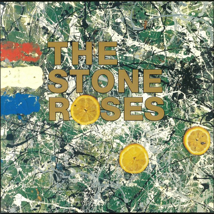
The Stone Roses - The Stone Roses (1989)
For me, this is a type of album cover that you know before you listen to the album. I adore the album itself of course (pun intended) but the cover has always stood out to me. It was created by the band’s guitarist, John Squire, who was heavily inspired by the abstract splattered painting style of artist Jackson Pollock. Frontman Ian Brown had met a French man when hitchhiking around Europe who had been involved in the riots, sharing the knowledge that lemons had been used as an antidote for tear gas. The piece is titled “Bye Bye Badman”, sharing its namesake with the song on the album. The end of last year saw the death of bassist Mani, and his coffin was decorated with the artwork in tribute.
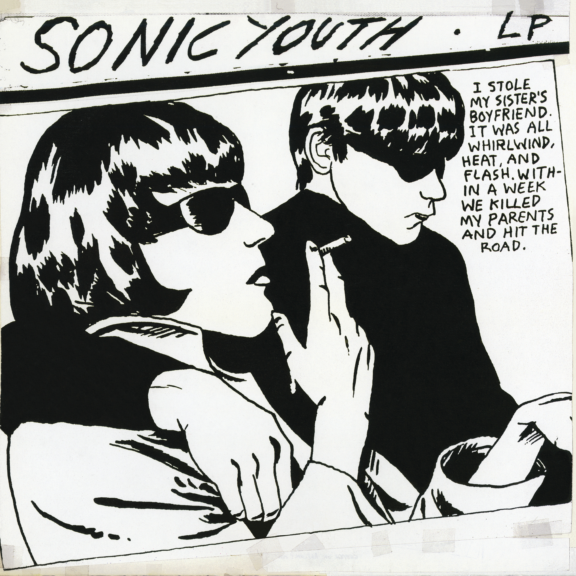
Sonic Youth - Goo (1990)
No one can tell me this album is not instantly recognisable as an iconic piece of art. Illustrated by Raymond Pettibon (worked with Black Flag, Minutemen),
this album cover is a dark tabloid tragedy that would be comedic if not for the subject of comic dialogue and once you gain further context behind the inspirations for this sketch. The illustration is based on a newspaper photo of the sister and brother-in-law of Myra Hindley, leaving court during the notorious Moors Murders trial. Widely parodied and culturally iconic. Recognisable for its pop-art style. Pretty sure I used to own it on a t-shirt purely because of how great I thought the album art was.
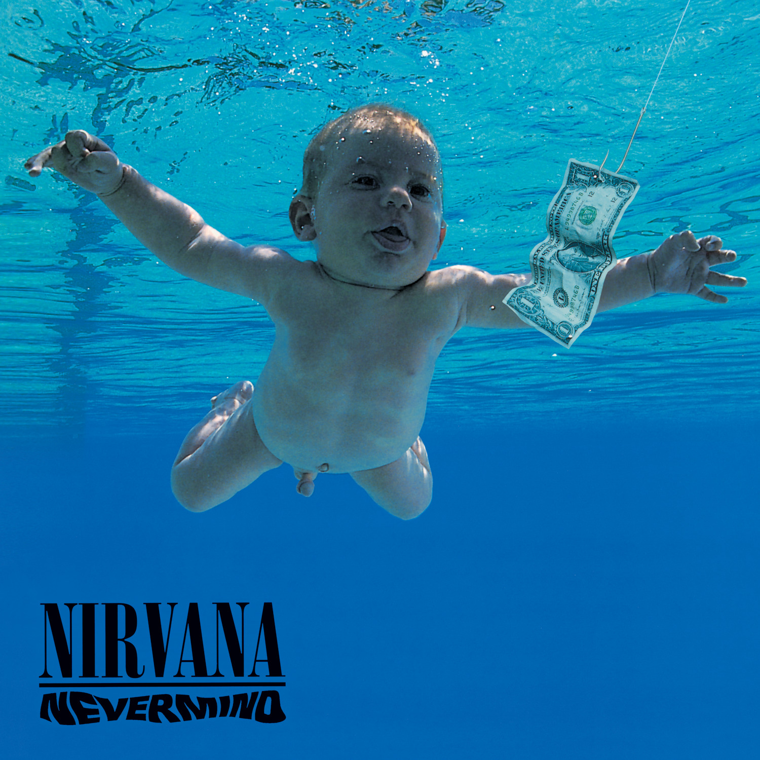
Nirvana - Nevermind (1991)
Growing up, this was the first album I ever bought on vinyl. Purely because the cover was absolutely everywhere, and maybe also because I was trying to seem musically cultured to the Camden Market record store employee. But when I look into what made me pick out this particular album, the cover definitely played a huge role in my decision.
Tranquil waters paired with a naked baby chasing a dollar. You could argue this is some metaphorical representation of themes within the album, but the concept itself was a result of Kurt Cobain watching a documentary on water births. With guidance from art director Robert Fisher, the actual photos themselves being too graphic and expensive to license. Photographer Kirk Weddle was tasked with underwater photography featuring babies swimming from parent to parent underwater. This cover is still talked about over 30 years later, with the focus now being on the legal case brought about by the infamous ‘Nirvana Baby’, spanning 4 years and still ongoing over the use of his image.
"But whatever your thoughts on the case, the cover is burned into every record store goer's mind for eternity."
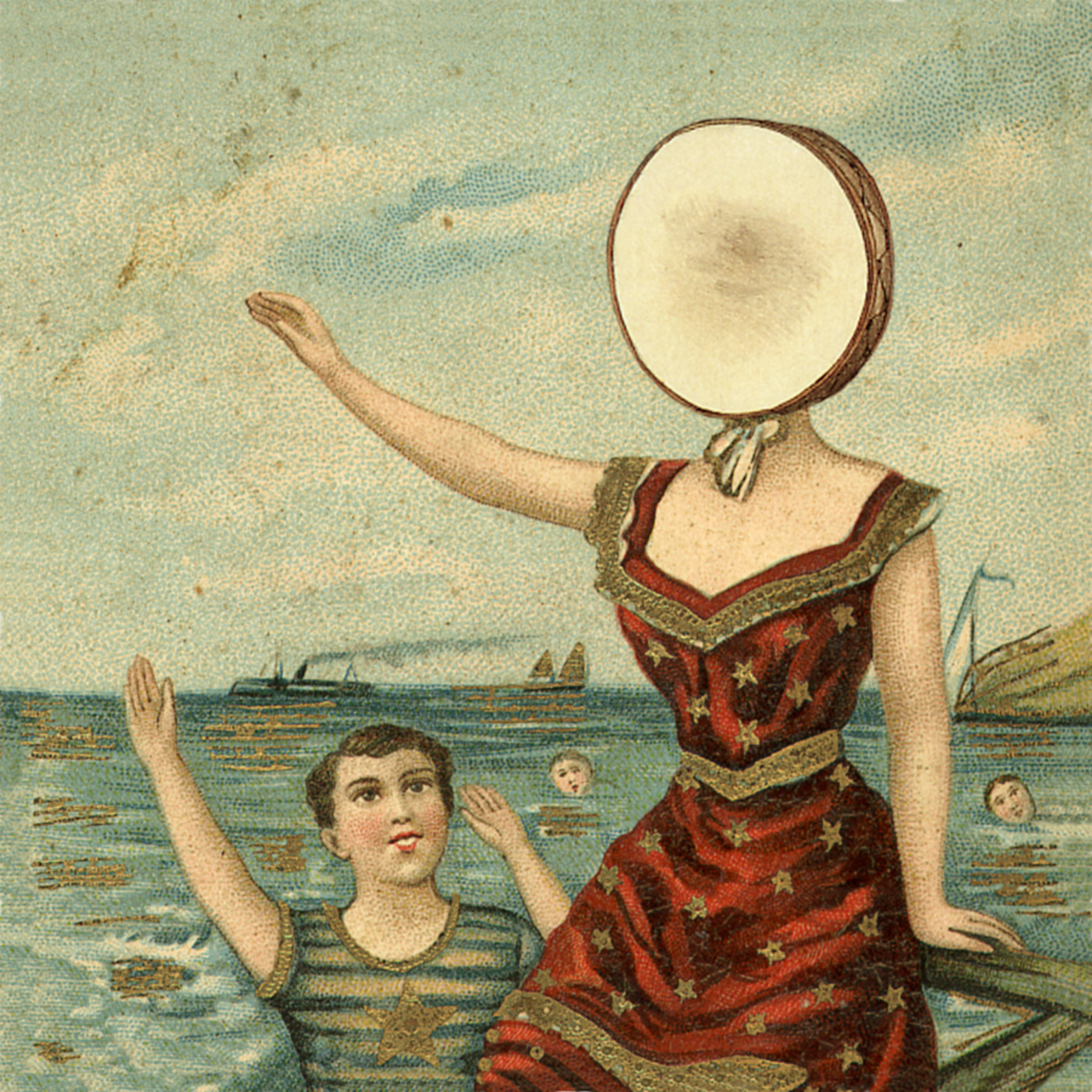
Neutral Milk Hotel - In the Aeroplane Over The Sea (1998)
A huge check in the box for me, as marks for a great album cover is anything based on or commissioned as a painting. And Neutral Milk Hotel’s In The Aeroplane Over The Sea is a belter of an album, with an all the more visually striking cover. Put together from a vintage postcard found in a thrift shop, edited by former REM artwork designer Chris Bilheimer, this cover reflects the aesthetic of seaside penny arcades from the early 20th century. With the addition of a drum head over the woman’s face. There’s been some speculation about the woman’s choice of arm extension, especially when you discover that this album is entirely inspired by The Diary of Anne Frank. I’ll leave you to come to your own opinions on this, but whether it’s on purpose or not, the imagery of this cover really captures the soul of the music and lyrical themes within this album.
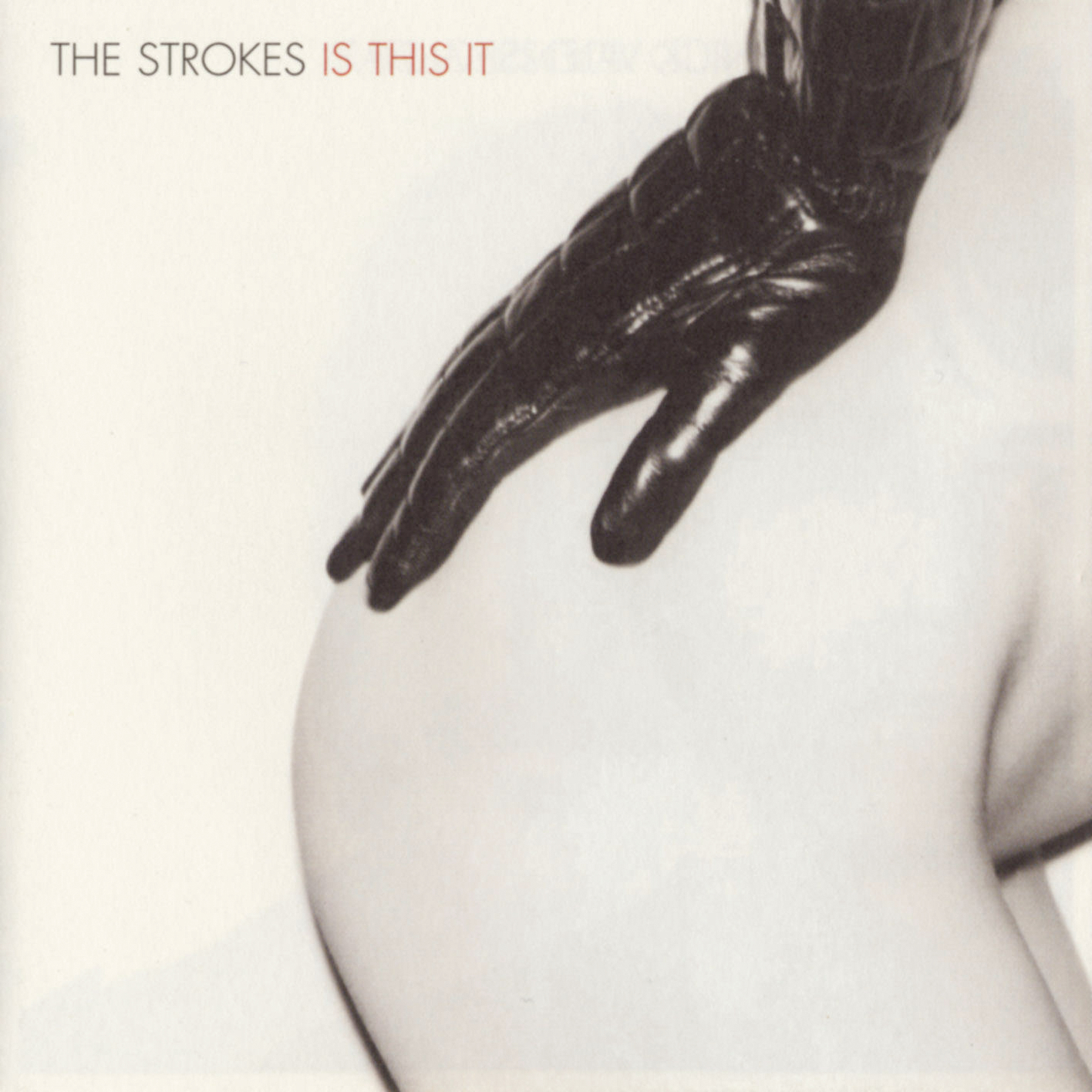
The Strokes - Is This It (2001)
Looking at this from a 2026 lens, it's insane to think of the controversy this album cover caused upon its release around the European market. The story of the photograph lies behind the lens of a man known as Colin Lane, and the subject? His girlfriend at the time. An impromptu shoot after a shower featuring a leather Chanel glove left behind by a stylist from another job.
The decision came about entirely by chance to use this as the cover of the band's debut album. Having worked with Lane on a photoshoot for a magazine, the label called him in to help the band finalise their decision for the cover. In the age before social media, this meant flicking through his portfolio, which included the impromptu photoshoot. Of course, most of us know what happened next - a wave of controversy surrounding the sexual nature of the image meant that the band feared how the American market would react.
Having also fallen in love with a psychedelic image of a subatomic particle in a bubble chamber, the decision was made to use this as the American cover. Interestingly, part of the image was also used in Prince’s Graffiti Bridge. It’s hailed widely as one of the greatest album covers of all time - and whether you agree with that or not, it’s certainly recognisable. I think part of this is owed to infamy.

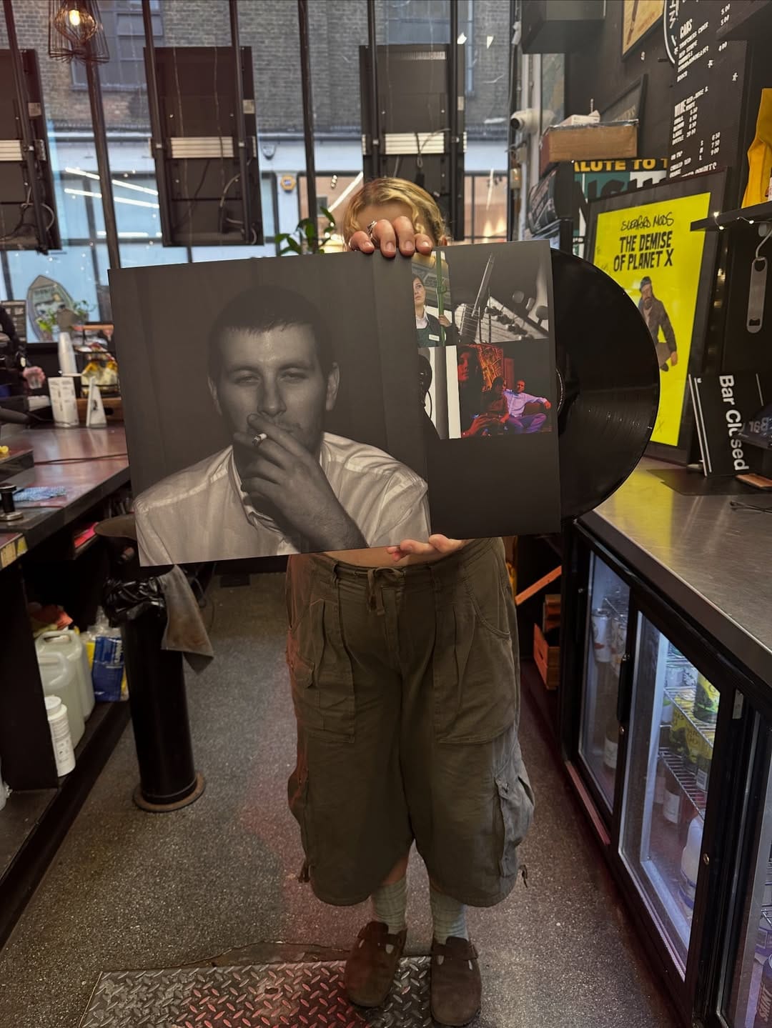
AM - Arctic Monkeys (2013)
Okay, now this one might be controversial in terms of which album I’ve picked to talk about. To give you some context, I’m an ‘01 baby. I can’t speak for the debut album release era, I know, I know, it was iconic, you had to be there, blah blah blah…I can speak for the commercial breakthrough and cultural online shakeup that followed Arctic Monkeys' AM. As a veteran of growing up spending a lot of time on unregulated social media, and the popularisation of platforms such as Instagram, Tumblr, etc. I shudder slightly at the recent surge of nostalgia from the younger end of my generation that are already romanticising this era on platforms like TikTok (it just feels way too soon and makes me feel older than I am, alright) - but I’m sure that sounds incredibly ironic to the generations that have been through this before me. Seemingly so simple, but bringing about a real greyish black and white aesthetic that culturally shaped indie music that succeeded (I’m talking the indie resurgence of about 2013-2016) - this waveform depicted in the album cover was inspired by an AM waveform signal, showing AM in the centre as the title of the album. Ever since, it has appeared on t-shirts, posters, and I think there are definitely some people with tattoos of this cover out there too.
"I’m sure I’m not wrong when I say it feels like this era of AM really brought forward a cultural online aesthetic which flooded and absolutely shaped a lot of people my age today. Wired earpods, black skinny ripped jeans, underage smoking with American cigarette branding, black Dr Martens, vinyl as an aesthetic, and black band tees."

Ezra Collective - Where I’m Meant To Be
And finally, a modern choice. This album cover was heavily inspired by Thelonious Monk’s Underground (depicting Monk as a French resistance fighter) with a modern twist. Leaning away from the Nazi imagery of the source image, and instead choosing to focus on their musical instruments and personal important items. The photograph features a studio in South London and glows with such a warm aura that it truly represents the music it introduces.
A modern homage to a classic album is certainly a way to bring familiarity to a modern release. There’s an element of chaos to the picture, but it certainly isn’t random, with each item being specifically chosen as important to each member of the group during the production of the album.
Alternative Artwork...
A picture paints a thousand words, or in the case of album artwork, it paints a culmination of songs, showcased through a snapshot of a cultural era. Artwork is entirely subjective - but what truly matters is what we’ve treasured through the test of time, either as a vinyl displayed on your wall proudly, or a weathered CD, loved to the point of skipping. Here are some further examples of music's most visually inspiring covers...
Smashing Pumpkins' Mellon Collie and the Infinite Sadness steam-punk aesthetic makes it one of the most recognisable covers in 90s alt-rock.
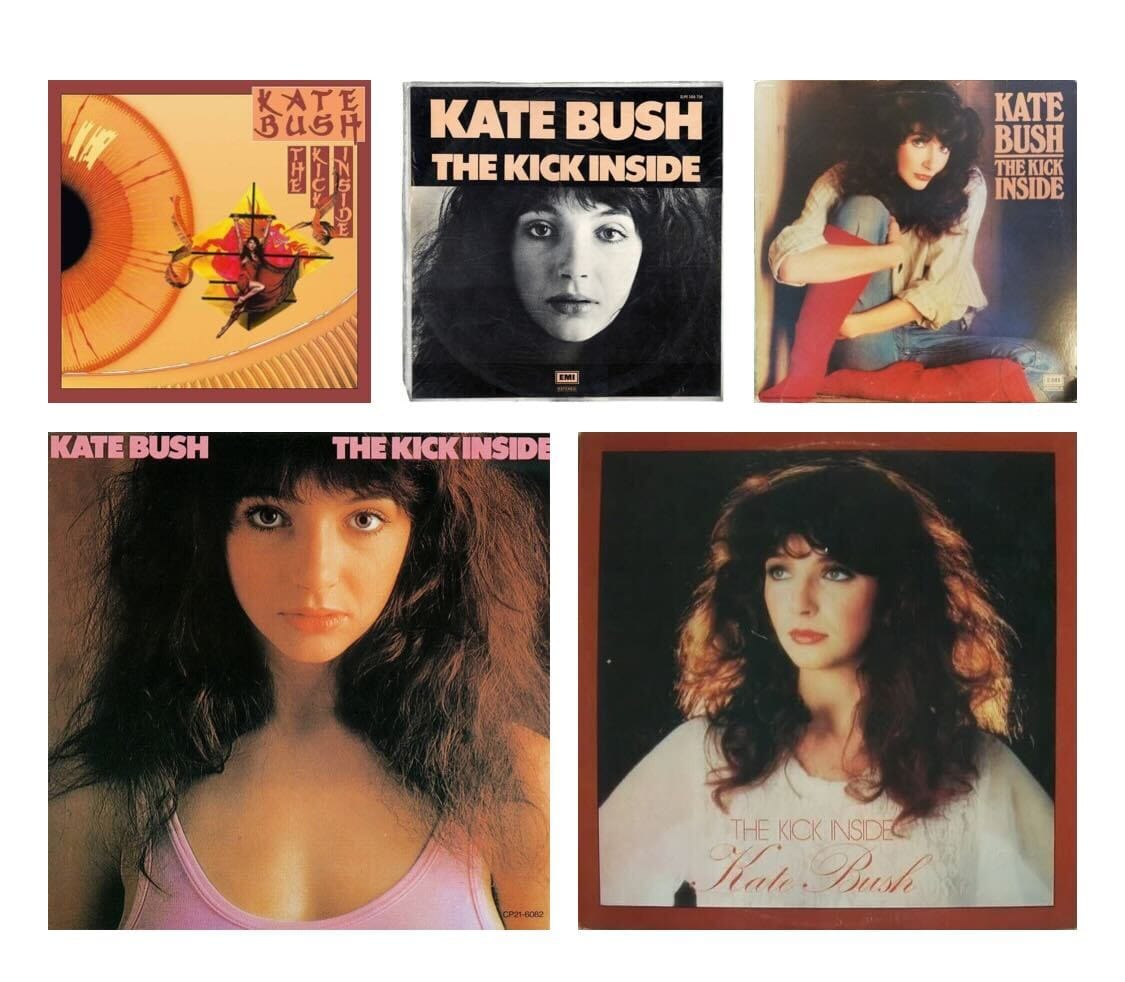
Kate Bush's stunning debut, The Kick Inside existed as six different variations, the most famous being the UK version, featuring a photograph of Kate, clinging to a large painted dragon kite, gliding across a vast, all-seeing eye.
The Clash's London Calling still remains the perfect visualisation of punk rock's defiance.

Grammy Awards 2026
The 68th Annual Grammy Awards brings to light a new category, titled ‘Best Album Cover’, highlighting an unrecognised, but all the more culturally treasured element of an album release. In case you’ve missed out on who’s in the run-up for the award, some of the nominations include:
Wet Leg - Moisturiser (Iris Luz & Lava La Rue)
Wet Leg returned to the scene last year with their sophomore album Moisturiser.
Hugely anticipated and fiercely delivered with an indie-rock edge.
Tyler,The Creator - CHROMAKOPIA (Shaun Llewellyn & Luis Perez)
Striking in both delivery and visuals, Tyler returned last year with his eighth studio album. A dark, sepia contrast to the saturated covers we’ve seen on previous albums, borrowing from a 1930s-40s Hollywood film.
Djo - The Crux (William Wesley II)
One of the biggest topics of conversation following the finale at the tail end of 2025 has been Stranger Things. And Joe Keery’s musical alias Djo has been capturing the hearts of fans and new discoverers alike.